Don’t hesitate to contact us:
Forum: discuss.graphhopper.com
Email: support@graphhopper.com
A few months ago we integrated and released more precise elevation data for our routing service. This is made possible by the great mapterhorn project, which accepts donations.
To analyze and debug this elevation data, we later released some important changes for GraphHopper Maps, which I would like to present in this blog post. The first and most prominent change is the new elevation widget at the bottom:
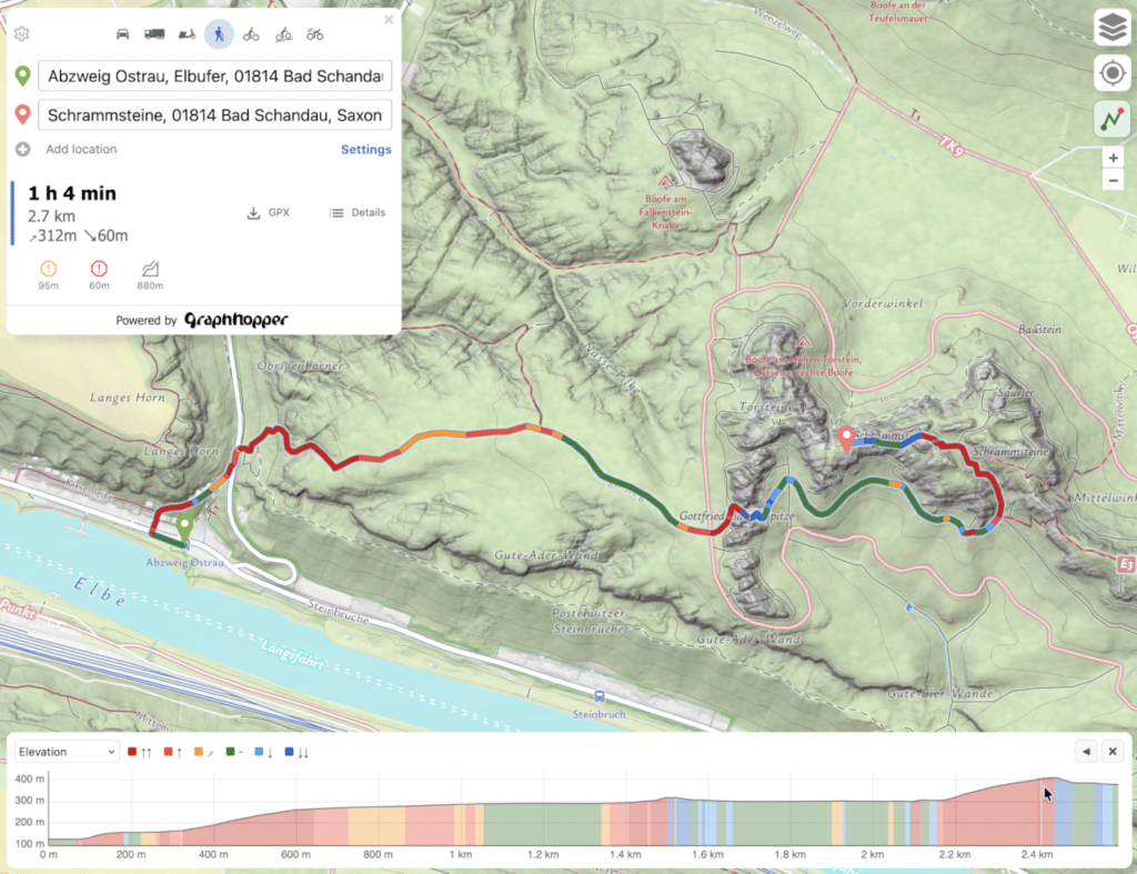
The elevation widget was written from scratch and solved several challenges with the old widget.
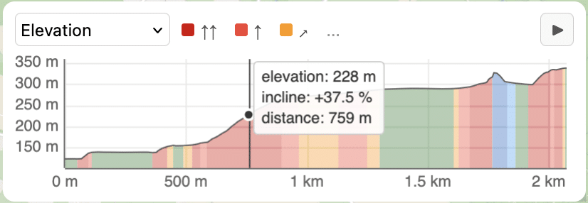
The most obvious change with the new elevation widget is that the slope is directly shown color-encoded in the chart and hovering it gives you the elevation and slope value directly in one place.
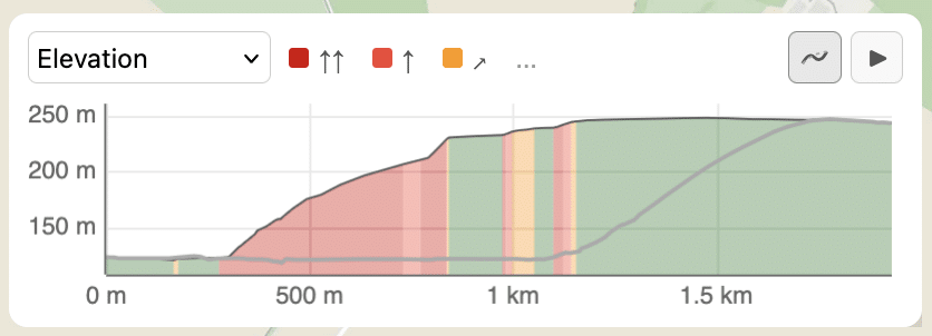
A nice touch is the alternative button at the top right of the widget (only shown if alternative routes are available), which overlays the elevation data of the alternative route(s) as gray lines directly onto the current elevation profile:
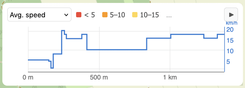
Also actual data like the average speed is displayed as a chart instead of color blocks:
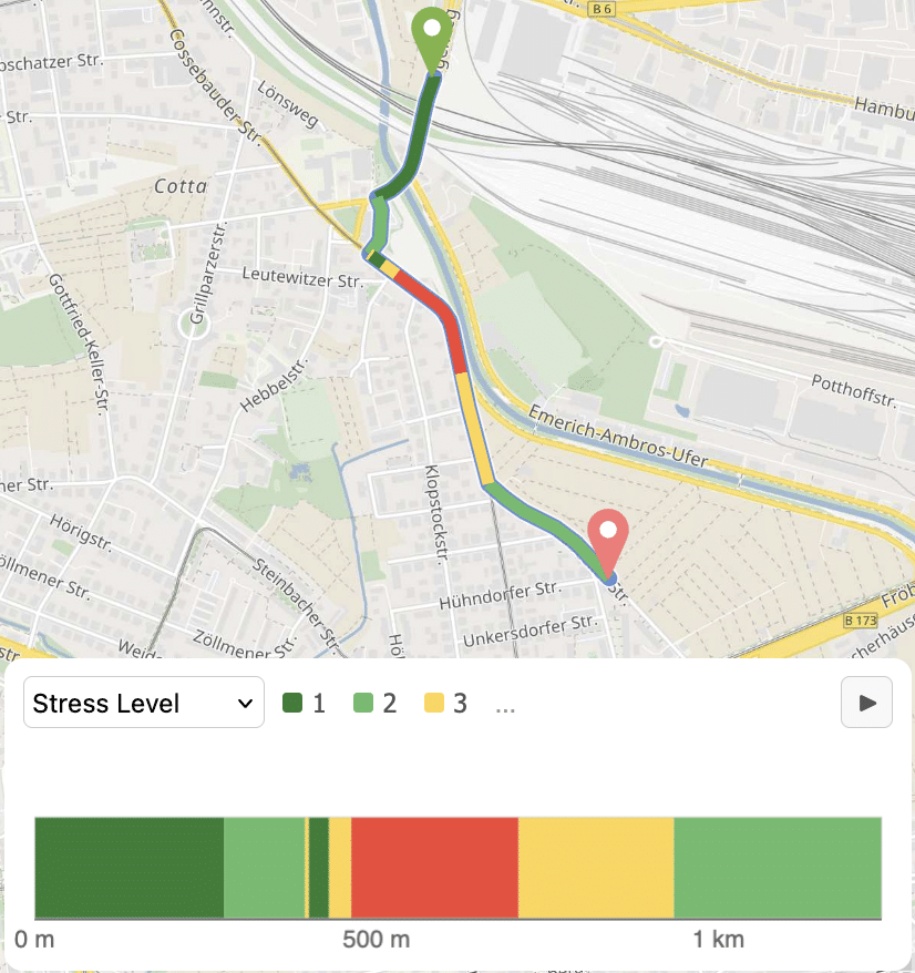
Note that the data is also shown color-encoded directly on the path too:
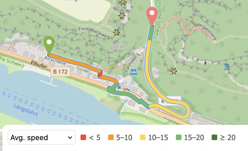
To enable the colored path for elevation you have to click on the path-color button on the right:
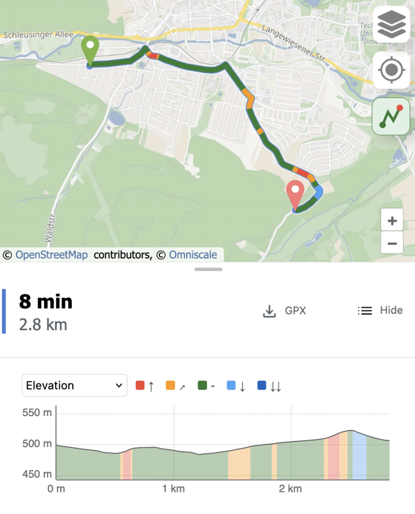
And as you can see in the previous picture: the new elevation widget also works now flawlessly on mobile devices.
There are a few more feature and you can read more about them here.
After I had more precise elevation data and a better visibility into it I had multiple ideas of what should come next. One of the ideas was to create an overview panel for statistics of route details. So instead of only showing the route details along the route, the new panel should give an overview and answer questions like “How intense is the elevation” or “How quiet is the route?” or “Is there bad surface along the route? And if yes, how many kilometers?”.
The new panel should make it easier to compare a route to alternative routes. Similar overview panels already exists for other route planners, but I think not in the same shape. I wanted it to work with all the useful route details and using the same and adequate color and also with a “collapsed” version that gives already a rough overview just based on the colors and portions of the bar (largest parts are on the left side):
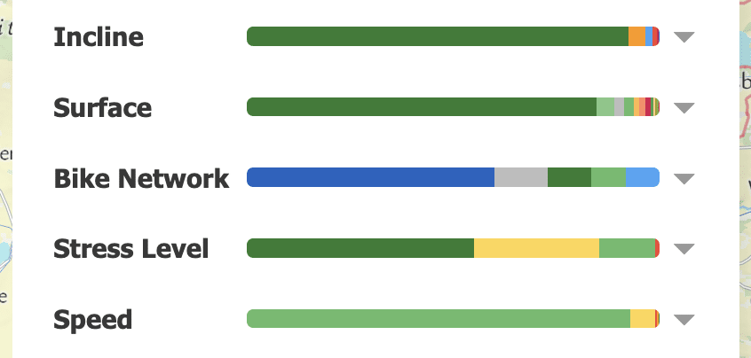
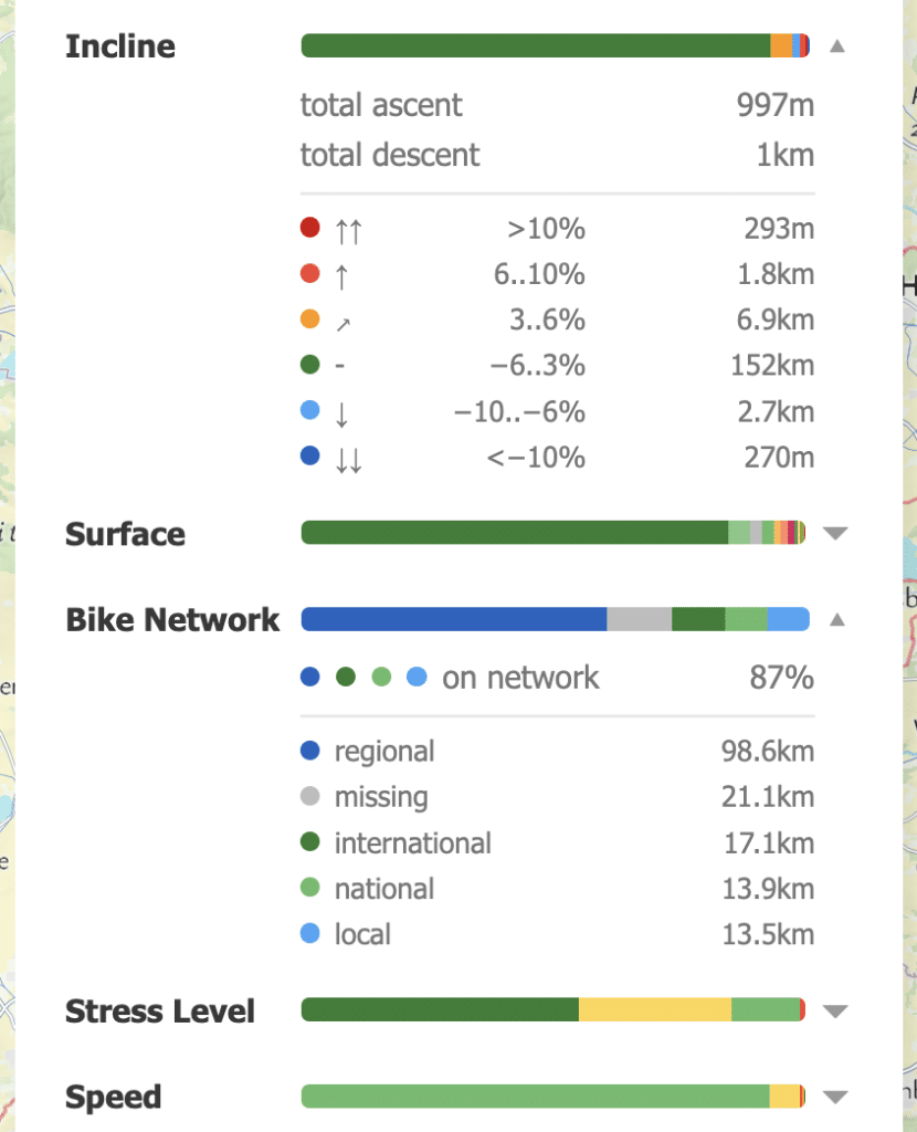
Every bar can be opened to view the detailed statistics. Usually the largest portion comes first but not e.g. for “Incline”, where the detailed values are sorted based on the slope:
For a bike profiles the “level of traffic stress” overview is additionally helpful, especially in areas without a strong bike route networks:
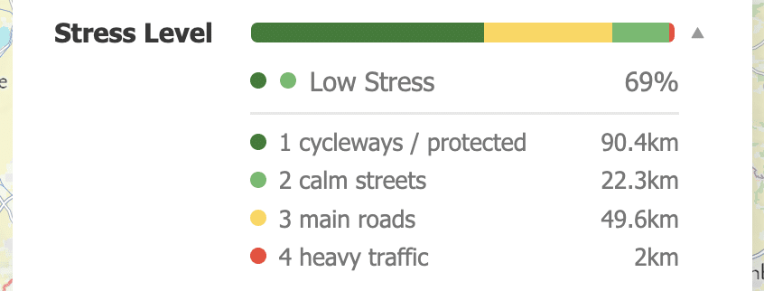
All these properties, including the stress level, are also available in the elevation widget and once selected you can see their values as different color directly on the path:
The elevation journey is not yet over and there are already more exciting elevation-related features and improvements in the pipeline.
Happy Routing!
